

What is the hottest area on the site? Where does the app fall? And why are there entire areas that the eye cannot see? Get the convenient and effective way to turn a gut feeling into a visual display and crack the explanations behind the numbers
Here are questions that come up in every team meeting in the world: How many visits were there to the site this month? How much did the article “do”? How did the post on Instagram work? And what is the status of the conversions? But that’s the easy case – for those, we know, there is a clear answer, available at any given moment. There are also more complex questions: What are our users clicking or hovering over right now? How far do they bother to scroll down? What distracts them? What works well on the desktop version but completely fails on mobile? So it turns out that we can also have this data at our fingertips.
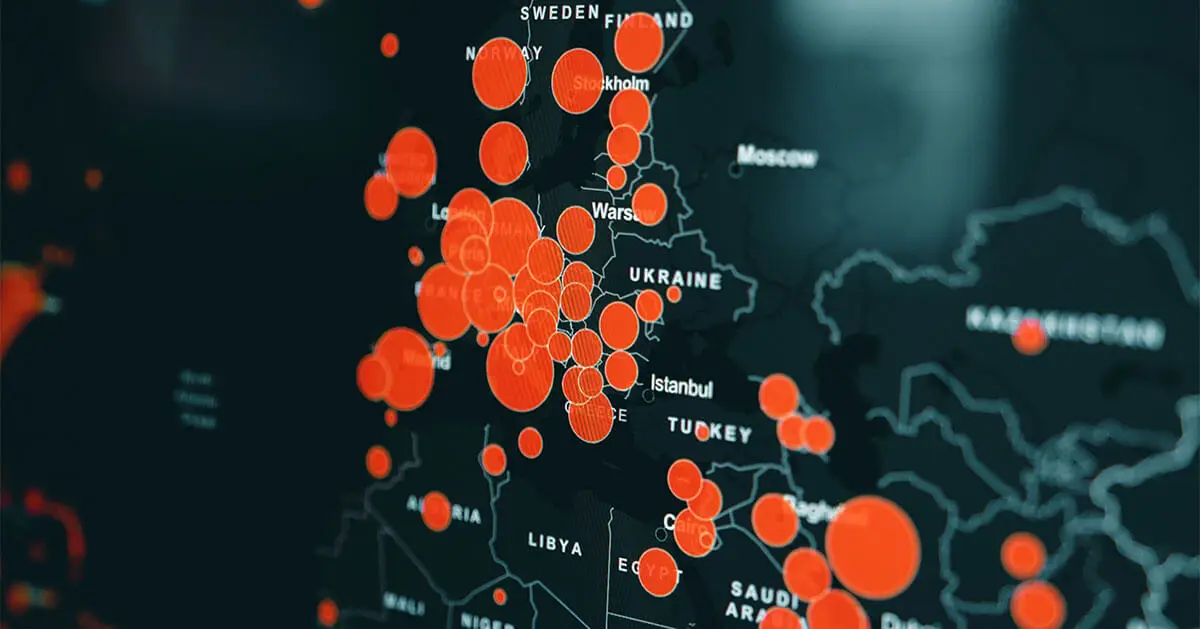
Heat maps are an intuitive, convenient and particularly effective tool for visually representing situations that do not amount to 0 and 1. A recent example: maps of the spread of the coronavirus, which divide the country and the world into “red” and “green” zones. Since the goal is to locate concentrations of patients, the color distribution is not binary but rather gradient. Another example: a map of the United States that colors each state according to the inclination of its voters – from dark red for strong Republican support to blue states, including reddish, light blue and purple swing states that will decide the election.
Bright red and deep blue are also the extremes in heat maps that measure performance and integrations on websites and apps. Here the gradient extends from hot to cold: “warm” shades – red, orange, yellow – for popular areas of the site, and “cold” shades for dead areas.
From the mouse to the pupil: Types of heat maps
There are several common types of heat maps, each time measuring and expressing a different type of interaction in an infographic:
Click tracking – Click maps – Is there a particular area where clicks tend to be more common? If there is one, it is a good idea to place the call-to-action buttons there (or rather remove links that turn out to be distracting).
Move maps – This reveals how our users scan the site: how they hover over the text, where they tend to stop, and what attracts their attention.
Scroll maps – The assumption is that as you move down the site, you are left with fewer and fewer users. This is not always true, but it is definitely something that such a heat map will tell us accurately.
Desktop vs. Mobile– A point-by-point performance comparison between the desktop version and other platforms can reveal instructive facts about mobile browsing habits. It often turns out that what we thought was working wonderfully is barely noticeable in the application, which may explain a drop in clicks and even conversions.
Eye tracking– A special measurement tool (probably less accessible) examines where the user’s gaze is focused and, alternatively, what they tend to ignore when interacting with the interface. Here too, the finding is obtained in the form of a heat map, in which a “warmer” color means that the area has received attention, or at least a more noticeable gaze.
Why it’s good
When it comes to the online world and especially to marketing and advertising within it, the metrics highlighted by heat maps – CTRs, CTAs, abandonment rates, UX, visual and functional functions, and more – are a real treasure trove. Now, instead of acting on gut feelings, we have a tool that measures performance in real time at the headline level, the area of the site, the areas that require scrolling, and the call-to-action buttons. And not only do we have such a tool, it is also backed by a visual quantitative illustration that makes it easier to convince customers, managers, investors, or other stakeholders that there is logic behind our decisions and that there are also results.
Heat maps can be embedded in the code itself, in a more expensive and complex process that requires programming, or through a paid or even free plugin from one of the vendors. It is advisable to embed the map on pages at the beginning of the site’s sales or marketing funnel, and choose to display only the options relevant to what we want to test and what can really be changed based on the results. Otherwise, it is simply ineffective and impractical “noise.” A heat map is an even greater tool when it is integrated with data and other tools, such as analytics of all site traffic and A/B testing.
In the “remote” routine where digital transformation is the name of the game, as more and more sales and applications move to virtual space, it is important that we reach the highest level of accuracy. The overall number of website readers is important, but it has long been insufficient. Heat maps are an ideal tool for cracking the explanations behind the numbers.

I am here to help you navigate the site and answer any questions about Gofman.
What do you want to ask?אם יש לכם שאלות נוספות, נשמח לענות עליהן בטלפון 03-7711141 או שתשאירו את הנייד שלכם, ואנחנו בהחלט מבטיחים לחזור אליכם בהקדם.