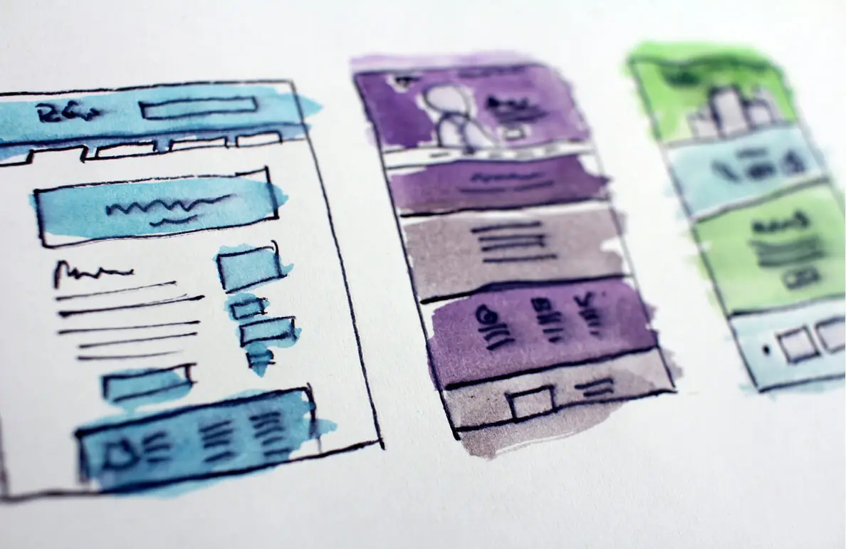


Slim, fast and interactive, with more 3D, environmental awareness and resemblance to the real store: this is how technology is changing the design of the web and applications, and these are the main trends that will characterize the field in the coming year
More than 1.8 billion websites have already gone online, and in the time it took you to read this, four more have probably been born. But how many of them are “good”? And what makes a website good?
A website is designed to serve a purpose – profitable, public, service or other. To achieve it, it needs an audience – surfers and users, loyal or casual, who will consume the information, perform the actions, often also pay their money, and maybe even spread the word. The way to maximize the chance of this happening is through an effective, attractive and pleasing to the eye user interface (UI) and a satisfactory, simple and action-motivating user experience (UX). Proper content hierarchy and effective design can be the difference between a quick abandonment and continued scrolling, sharing, returning – and even converting.
If we were to summarize the latest design trends in three words, they would be: Less is More. Presenting as much as possible with as little as possible. Screens loaded with information and details are a bit 2010. Today, whether for reasons of aesthetics, impatience on the part of users, the effects of mobile or a fear of burdening the loading, the clean version is preferred. Minimalism, conciseness, highlighting sections and highlighting numerical data (“tasting”) – that’s where business converges.
As always, there is a trend – and a counter-trend: in color – a rich gradient, which already hints at the nature and purpose of the site with color, versus reducing to two shades (duotone) that conveys something more modest and friendly; in visuals – from generic repositories, versus authentic and specific images from the company or location; In outlines – symmetrical and aligned, as opposed to grid breaks and games within the design; and in scrolling – one page, with everything on one scroll, as opposed to a more nostalgic web, with rich navigation and internal interaction (which may be less effective on mobile).
Alongside minimalism, other trends in digital design can be identified. Responsive development, which also takes into account tiny screens and ensures that the display adapts to any resolution and platform; the transition from web design to application development, which is designed to maximize display and user experience for mobile consumers while increasing interaction with them; increasing use of artificial intelligence and automation – all of these are expected to intensify, diversify design tools and refresh our virtual space, which, while not expected to undergo a revolution in 2021, is never stopping being upgraded.
Here are 9 trends to watch out for this year:
3D Interaction
The use of 3D is still in its infancy, and quite a few sites are still implementing videos as an alternative. But in more and more cases, innovative technologies are already being used that allow items to be moved using the mouse or finger. In e-commerce, this allows a product to be rotated, examined from every angle, and a little closer to the real store. Another growing trend is micro-interaction: a UX tool that initiates a response, in animation or otherwise (for example, a slight shake of the smartphone), to the user’s action. But not only in movement: neomorphism changes the appearance of items on the screen and adds life and prominence to them, without at the expense of cleanliness and avoiding overload. Without going into a lesson in the history of design, let’s just say that the new capabilities of adding effects such as a soft shadow through CSS refresh the flat design and make the site up-to-date, efficient, three-dimensional, and with the possibility of “pulling” elements from it as a trigger for action.
Shop from home, feel like you’re in a store
Virtual reality (VR) and augmented reality (AR) technologies, which have long been used in the gaming and entertainment worlds, are entering more and more areas and are also enjoying an upgrade in browser display options. Today, it is possible to “measure” a garment online, try on different designs for a home based on its natural environment, navigate between screens and menus with 3D glasses, and take another step towards closing the gap between the physical and the virtual.
Click to scroll
Long scrolling is one of the effects of mobile. It is effective in the case of a lot of content with a low value for numbering, or for sites with a customized algorithm filter that creates a hierarchy of information and order of priorities for the user. Social networks and some blog sites have taken this to the extreme, with endless browsing that loads more and more content as the screen “ends.” It is important to adapt long scrolling to search engines: avoid overlapping and repetitive content, assign a separate URL to each section or subcategory, allow the user to quickly find what they are looking for and “jump” there, and of course ensure reasonable loading times. Another trend in this context is Parallax, sites with combined scrolling – horizontal and vertical, or at different speeds and with different functions for each layer, in order to create a unique and deep user experience. It is an effective tool in storytelling, as reflected in the Pulitzer Prize-winning feature Snow Fall of the “New York Times” or on the website Every Last Drop.
The race to load
The importance of performance is becoming critical year by year, and this is also due to the influence of mobile. The demand today is for as little loading time and as few memory-guzzling components as possible. This means: to consider, literally, “heavy” and complex visual elements; to use “lazy loading”, which waits for the user to approach the end of the scroll to load what is hidden there below; and to ensure that visual items do not load from top to bottom, with the direction of scrolling, but rather appear immediately in poor quality and fill gradually. In terms of speed, the move to one page is positive – loading one scroll is shorter than several at the same time. And if the user is destined to wait, at least let them know how much more is left: a loading bar will not shorten the wait, but it may make it “bearable” and prevent abandonment.
Targeted display
The information we have about the user and their usage habits, combined with modern analysis tools, can help target them not only in terms of content, but also in terms of display and experience.
High-quality graphics
Many designers use the SVG language, which provides accessibility, control, the ability to perform manipulations relatively simply, and even allows the user to change objects themselves. Flexible items that adapt to the site and platform can be implemented, or ready-made items can be found in repositories, including free ones.
Night mode
More and more sites and browsers are offering the Dark Mode option, and more and more users are preferring it to reduce distractions and glare in low-light conditions. Designers can add a button to switch between modes, but a more elegant way, made possible through CSS or JavaScript, is to automatically adjust the site to the Mode that the user has defined for the browser. The improvement in user experience will justify the extra effort in writing the code. By default, the design is still oriented towards a bright state, but this may soon change.
Where is the chatbot?
Machine learning and technological leaps are streamlining this function and increasing the feeling of a conversation with a human. Still, the answers are still taken from a finite and generic database, and their trust remains limited (although there has been improvement since the arrival of Siri, Alexa, and the like). This area is expected to continue to improve, and it will be interesting to follow in 2021.
With the environment in mind
Interest in ecological and community issues increased dramatically in 2020, with the outbreak of the corona virus and the intensification of the damage caused by global warming. This will have an impact on design, with more visuals and “real estate” allocated to the subject as part of building the image and reputation of a company as caring, involved, aware of the consequences of its actions and encouraging wiser and greener consumerism.
In conclusion, the trends combine a “lean” and effective interface with interactivity. Multidimensional elements are supposed to add life to the somewhat frozen online experience – as long as they do not come at the expense of access, browsing and compatibility for any device. 2021 opens up a wealth of opportunities to create an elegant, enjoyable and engaging user experience. But if we return to the question we started with, smart UX and good design, even before the “wow effect”, remember the purpose of the site, put the user at the center and adapt the content, functionality and display to the user, and not the other way around.

I am here to help you navigate the site and answer any questions about Gofman.
What do you want to ask?אם יש לכם שאלות נוספות, נשמח לענות עליהן בטלפון 03-7711141 או שתשאירו את הנייד שלכם, ואנחנו בהחלט מבטיחים לחזור אליכם בהקדם.